
Project Overview
Project Type: Academic
My Role: UX Researcher, Design Strategy, UX/UI Designer
Timeline: 12 Weeks (Between 2021 - 2022)
Tools Used: Figma, Adobe Illustrator, Marvel, Miro, UserTesting, Usability Hub, Optimal Workshop, Google Forms (Surveys) and Zoom.
Initial Hypothesis
An intuitive and simple mobile app that can be used easily on the go and that helps users to learn new vocabulary in context casually in just 5-10 minutes per day will facilitate their regular learning process to help them learn faster.
Challenge
Many of us deal with a lot of stress on a regular basis and find it difficult to find free time to learn new vocabulary and new languages and stick to the goal and stay on track. Many of us do not have enough funds, determination or time to attend regular classes to study to learn a new language or gain new skill.
FlashCardio was a project that I completed while attending CareerFoundry Bootcamp. FlashCardio is a mobile app designed to help others to improve their vocabulary and learn new languages easily on the go in a simple yet organized way. The app offers customization allowing users to track their learning progress and provides engaging learning challenges helping them to maintain a regular learning habit.
Design Process
I utilized the Design Thinking and Double Diamond methodologies throughout this project. These processes helped me to uncover the real problems faced by people when learning new vocabulary to create the best possible solution for them.


Competitive Analysis
In order to gain an empathic understanding of the problem I was trying to solve and to get to know the market and products available better, I conducted a competitive analysis of my direct competitors.
Goals:
Discover potential usability problems in existing products.
Understand where my product stands in the market.
Gather insights for my design process regarding competitors’ strengths and weaknesses.
Spot potential opportunities for my app


User Interviews
In order to learn more about people’s attitudes and fears towards learning new vocabulary and new languages and to discover their goals and frustrations, I interviewed 5 participants in the age range of 29 - 36 based in Europe and USA who are currently learning new vocabulary or have been recently doing so.

Interview Goals:
Gain insights into people’s vocabulary learning motivations and habits.
Discover which methods people use to learn new languages.
Uncover main frustrations and pain points when it comes to learning new vocabulary.
Find out how much time people spend on learning new vocabulary regularly.
Discover what motivates and demotivates people when learning new vocabulary.
Empathy Map
Following the user interviews, I created an empathy map to capture and analyze the participants’ behaviors and attitudes towards vocabulary learning. It helped me to better understand my potential users.


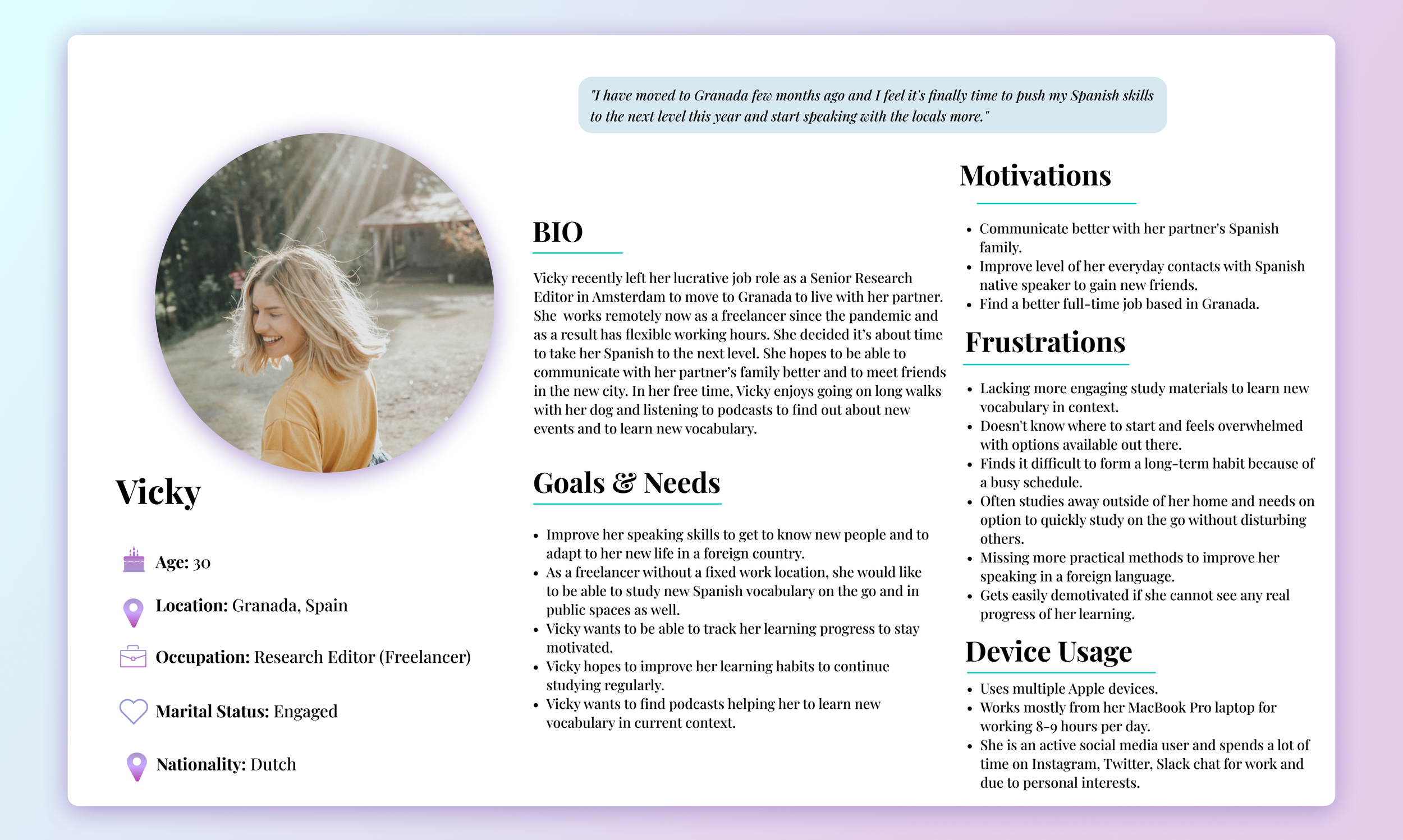
User Persona
To ensure that my app is designed with the real user in mind, I created a user persona representing demographic information, goals, needs, motivations and frustrations extracted from user interviews.

Task Flows
Full of insights and user discoveries from the user research, I started building the app structure. I started off by creating task flows in order to to map out and understand the steps our users would take to complete main tasks within the app to be able to accomplish their goals.


Wireframing & Prototyping
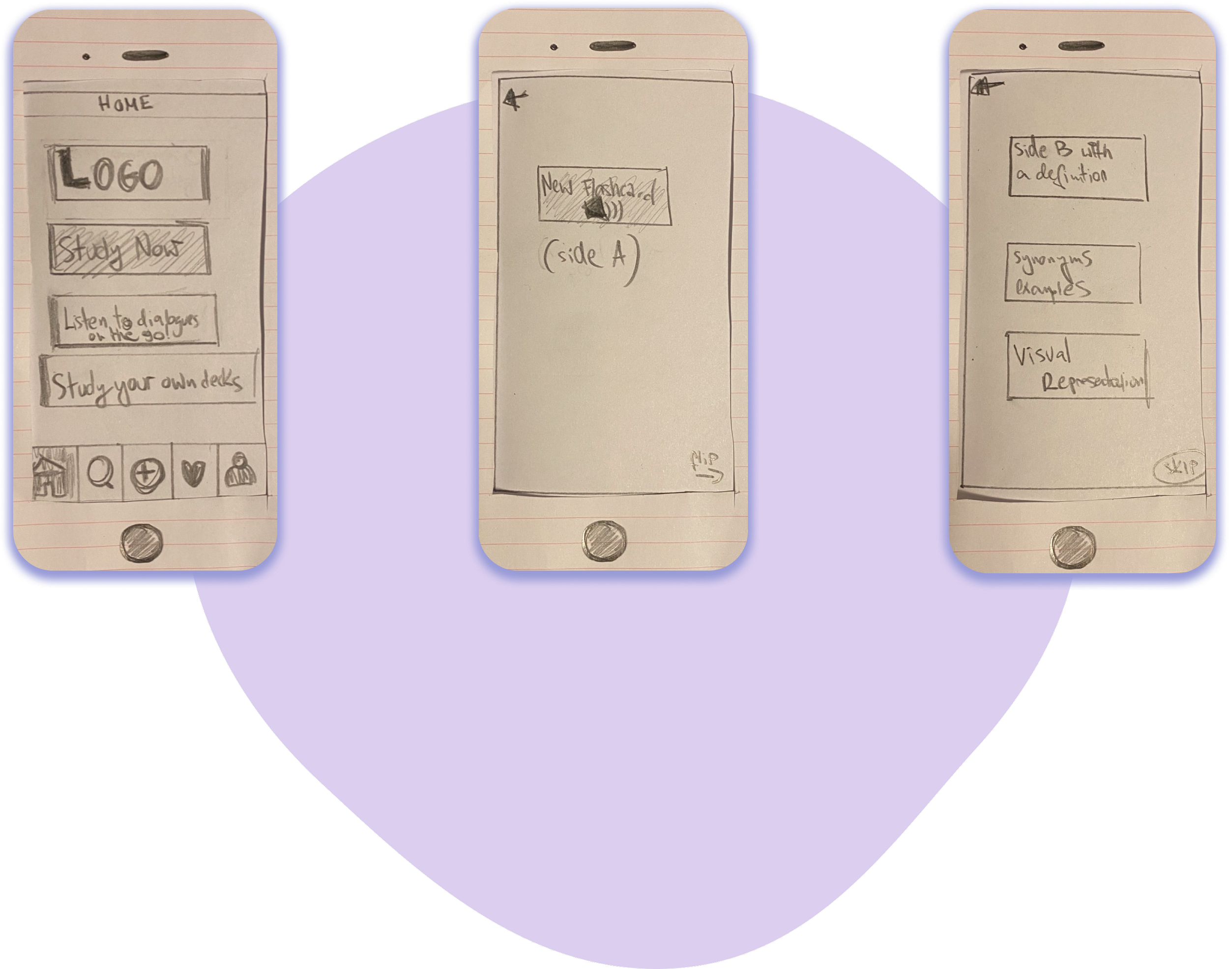
Exploratory Sketches
After getting a clearer idea of the main tasks our users would be going through using the app, I started sketching different versions of low-fidelity wireframes using rapid prototyping approach. I was inspired by my favorite vocabulary learning apps and online learning services providing an engaging and intuitive way of learning on the go for people of all ages.
Sign Up & Onboarding

Studying with Flashcards
Mid-Fidelity Wireframes
After further iterative sketches I created my first version of the prototype. I combined all the wireframes into a clickable and interactive prototype. The wireframes gradually became more detailed in order for me to test them in action during future usability testings.
Sign Up & Onboarding

Studying with Flashcards


With my first grayscale prototype ready, I conducted 8 remote usability tests.
I wanted to uncover any potential usability issues, spot opportunities for improvement.
Users were asked to perform 4 tasks using the prototype. Sessions were recorded via Zoom using screen sharing option.
Test Objectives
Observe if users can accomplish the task given.
Identify areas of improvement in terms of functionality and user experience.
Discover the most common pain points while trying to complete the tasks.
Results were analyzed using Jakob Nielsen’s error severity rating scale to determine which usability problems need to be addressed most urgently and to determine my next steps. I took into consideration the frequency of the problems, the impact and the persistence.

Issue #1: No progress bar while studying with flashcards.
While all users had no issues with finishing the study with flashcards session, 5 out of 8 noticed it would be helpful for them to see how many flashcards they have left or how many they studied already.

Issue #2: No option to end studying session whenever the user wants.

Issue #3: System shows the same flashcard even if the user swiped right (Got it)


After improving the prototype, testing and making several further iterations, I started working on a final high-fidelity prototype. As a first step, I needed to define a visual identity for the app.
While designing FlashCardio’s logo, branding and user interactions, I focused on creating a visually friendly and welcoming space for our target user base.
FlashCardio was picked as the app name for its fun and active connotation to quick physical exercises. Our app was designed to deliver fun and effortless learning experiences in a form of quick casual yet informative lessons.

Color Palette

Typography
I have chosen Futura as my main typeface due to its elegant yet simple look. I used it mostly for the headlines, titles and body text. Because of its geometrical forms, it proved to be very readable and visually appealing. For small-sized text used for some fields and forms I used Raleway. It’s a very elegant sans-serif typeface and fits perfectly with the tone and voice of the app.

Tone & Voice
I wanted to create a friendly and welcoming atmosphere for FlashCardio users and hence I’ve carefully chosen an inclusive, expressive, playful yet informative voice. I wanted to help users relate their learning experience to their real life by using simple words and instructions and by toning down negative messages.

After defining the visual identity for FlashCardio, I applied the changes and polished the UI further which resulted in the final prototype.

High Fidelity Prototype
Please view below the final interactive prototype version done in Figma.

User Research: Through extensive user research, interviews, and usability testings, I was able to design an interactive prototype solving the user problem. On this journey, I learnt how crucial the user research is in untangling real problems faced by people to be able to ultimately create viable and meaningful solutions for them.
Listening to people: Only by having conversations with people and truly listening and empathizing with their stories can we learn about their journey with all the pain points and little victories. As a result, we discover their needs and their challenges which helps to create meaningful and inclusive products and provide unforgettable experiences for our users.
You are not the user: I learnt yet again about the importance of feedback in the process of creating usable and meaningful design solutions. I understood in practice that detaching oneself from the design is really important to be able to make gradual improvements. Design is all about constant iterations based on user and peer feedback and that’s also a fun part about it.
Next Steps:
Conducting further usability tests to identify any usability and accessibility issues.
More iterations - based on the user feedback, I am planning to gradually improve the existing features and add new ones.
Thank you for reading!
Check my other projects:
Head back home:
Copyright © 2026 Karolina Kopacz. All rights reserved.