
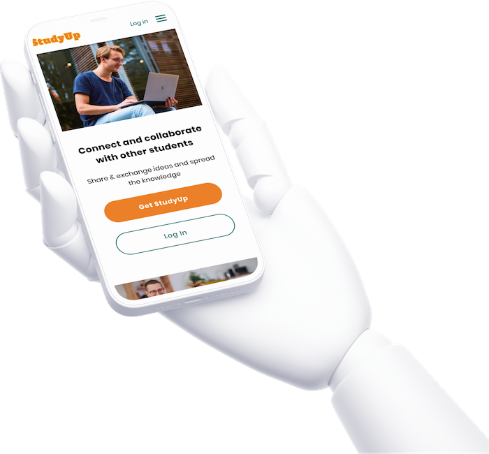
StudyUp - Responsive social networking web app dedicated to students.
Context: Case Study
Sector: Education
Role: UX/UI Designer
Timeline: 10 Weeks | November 2021 - February 2022
Tools used: Figma, Miro, Lucidchart
Client: CareerFoundry
Introduction
StudyUp was a project which I completed while attending CareerFoundry UI Specialization Program. StudyUp is a responsive web app dedicated to students around the world. It is an easy-to-use and intuitive platform helping students engage with a like-minded student community whenever and wherever they are. It is therefore especially useful for those juggling their studies with a job, family, illness, etc.
Objective
The challenge was to design a web app for students to connect with other fellow students to collaborate and exchange ideas. In order to be able to come up with some meaningful ideas, I needed to get a better understanding of problems faced by students as well as research platforms available for them. As a part-time student myself and a firm believer in lifelong learning, I found this design challenge particularly interesting and insightful.
Problem Statement
Due to the pandemic students are mostly studying remotely and online. They are lacking the personal connection with other fellow students which decreases their motivation and mental wellbeing. They need a way to stay motivated and inspired, exchange ideas with others and get peer-feedback.
Solution
StudyUp will enhance the learning experience of students by connecting them with peers located around the world who share similar interests and goals. This responsive web app will serve as a welcoming community for students to share and critique work, get inspired, and collaborate.

Define and Ideate
As this project was focusing on UI Design, UX research has been done and provided, including the user persona which was created to help us empathize with our target audience.
User Persona
User Flows
Based on the project brief, I created user flow diagrams to decide which screens should be designed in order for our users to accomplish their goals.

Objective 1: As a new user, I want to create a profile, so that other students can find me.

Objective 2: As a new student, I want to connect with other students interested in the same subjects (or a related subject), so that we may collaborate.

I created low-fidelity wireframes to illustrate the main functionality of the app. I turned my pen and paper sketch into digital wireframes in Figma.

From mid to high fidelity
After rounds of usability testings and feedback from my Mentor, I made further iterations of the mid-fidelity wireframes to improve visual hierarchy and spacing. I wanted to ensure the style is consistent across all screens to provide a smooth and frictionless experience for our users.


Mood Board

Color palette
Carefully selected color palette for StudyUp evokes welcoming and positive emotions and therefore should fit perfectly with the tone and character of StudyUp. Primary mellow orange color symbolizes inspiration and is said to boost creativity which is essential when learning and gaining new knowledge. Accent teal green color is a beautiful combination of green and blue which is said to bring balance and help restore creative energy. Delicate and warm tertiary yellow color brings calmness and restores energy by bringing a sense of healing.

Typography
Poppins type font is sharp and clean. Thanks to its geometric style it makes the design look modern and easy to read. It’s playful but professional and therefore fits perfectly with the personality and tone of StudyUp.
As a type face representing the product logo. Alfa Slab One was used. It is a contemporary take on the Six-lines Pica Egyptian. It is bold, modern and catches immediate attention. It only comes in heavy weight and therefore offers extreme color density. It’s it a good match for a clean and inviting logo.

UI Elements
A list of StudyUp UI components designed to work harmoniously together.

Iconography
Outlined Icons were carefully selected in line with Material Design guidelines.

Imagery and Illustrations
Dos & Don’ts
Images should help to tell the story
Avoid using too many distracting images and remember that imagery should enhance the user experience and express the brand and convey the message.
Images should be informative, delightful and intentional.
Use only high-resolution photos only.
To ensure accessibility, imagery should include alternative text (or a caption) to be read by screen readers for users with visual impairments.


I followed mobile-first approach in my design. However, I wanted to ensure that our users can access the platform on multiple devices of various sizes. Once my designs of the main screens of the mobile version were ready, I created responsive breakpoints for larger screens, such as tablet and desktop.

Breakpoints - Landing Page and Dashboard


After updating and polishing further my high-fidelity wireframes, I created a new fully interactive prototype. Following user testings I made further improvements.


Conclusions and Lessons Learnt
Color Palette - Less is more.
I quickly learnt during the UI design process to avoid overloading the design with an abundance of color as it can distract our users from the main functions on the screen. I discovered how to embrace minimalism and how to apply color strategically in order to bring the user’s attention to the most important functions and to avoid potentially misleading or confusing them.
Iterate as much as possible.
It takes many attempts and redesigns to find the right solution and to ensure that every aspect of the app is designed with intention. I ended up coming up with many design ideas and some of them were quickly discarded by myself or as a result of usability testings to ensure truly user-centric design approach.
Finding the right balance between UX and UI.
As this project was focusing mainly on the UI design and visual interaction, it helped me to realize the importance of UX design in a wider context. Apart from the UX research which was done and provided for me in the project brief, I performed market and user research on my own to try to truly discover and understand the needs and main pain points of my potential users. It really helped me to empathize with the users to create the best possible experience for them.
The power of interaction design.
I greatly enjoyed experimenting with animations and interactions throughout this project. They all compliment the design in an amazing way making the product engaging and easier to use. I learnt a lot about the importance of microinteractions which are a great force when it comes with communicating with the user.

Thank you for reading!
Check my other projects:
Head back home:
Copyright © 2026 Karolina Kopacz. All rights reserved.