Money Cabbage
Money Cabbage is a responsive web app designed to make online payments, splitting bills and budgeting simple, fun and secure.
Project Overview
Context:
Money Cabbage was designed for my main student solo project at UX/UI Design CareerFoundry Program. The goal of this project was to create a responsive web app allowing anyone to shop easily and securely online, transfer money, and much more without a physical debit or credit card.
My role:
UX Researcher, UX/UI Designer, UX Writer
Project duration:
30 Weeks | February 2021 - October 2021
Client:
CareerFoundry Bootcamp
Tools:
Figma, Balsamiq, Adobe Photoshop, Usability Hub, Optimal Workshop, Google Forms, Pen and Paper
Initial Problem Statement
Many freelancers and professionals have to handle cash payments from their clients directly on a regular basis. The pandemic has increased the need for safer and easily accessible remote payment method to replace unsafe cash transactions.
Hypothesis
By enabling users to quickly and easily request and make payments on the go & track their past transactions, we will see them more engaged with growing their business instead of worrying about finances.
Solution
Money Cabbage will be a responsive web app allowing people to make quick and safe payments on the go. Equipped with engaging budgeting feature, it helps users keep their spendings under control to be able to save up for their dream goals.
Design Process
I followed the design thinking process throughout the entirety of this project.
As the very nature of the design thinking process is iterative and human-centered, it fit perfectly here as it allowed me to get real understanding of users and helped me to uncover their needs. Through the constant iterations, I was able to discover the best solutions for the problem faced.

Understand the Problem

Competitive Analysis
To get a better understanding of problems faced and to determine my next design steps, I researched and analyzed my closest future competitors. My investigation helped me to get a better understanding of the market and allowed me to examine what solutions already exist and observe main strengths and weaknesses of my direct competitors. Additionally, it allowed me to examine solutions offered to some of the user problems and see potential opportunities for my product
I chose to perform a competitive analysis on two web apps offering financial solutions for professionals and small businesses to explore potential problems and opportunities available there - Payoneer and PayPal Business.


User Research
Survey Insights
After gaining more information about the existing competition and getting better understanding of the market, I spotted potential threats and obstacles on my way, but also discovered opportunities for my product.
With that in mind, I continued my journey and conducted extensive user research.
As a first step, I created online surveys to get insights into people’s preferences regarding financial payment platforms and to find out more about their online shopping habits. I learnt as well about their attitudes towards saving and budgeting.

User Interviews
After analyzing feedback from user surveys, I conducted detailed user interviews to get valuable insights
and qualitative data into people’s financial preferences and to spot pain points and main challenges encountered by them.
I created a detailed interview plan and conducted 4 user interviews. Due to the pandemic limitations, 3 of the interviews were remote and 1 was done in-person. I moderated the interviews and with participants’ consent I recorded and analyzed the interviews closely afterwards.
Participants
I selected Participants who had experience with online banking and payment apps and were between 25-45 years old to fit my target demographics.
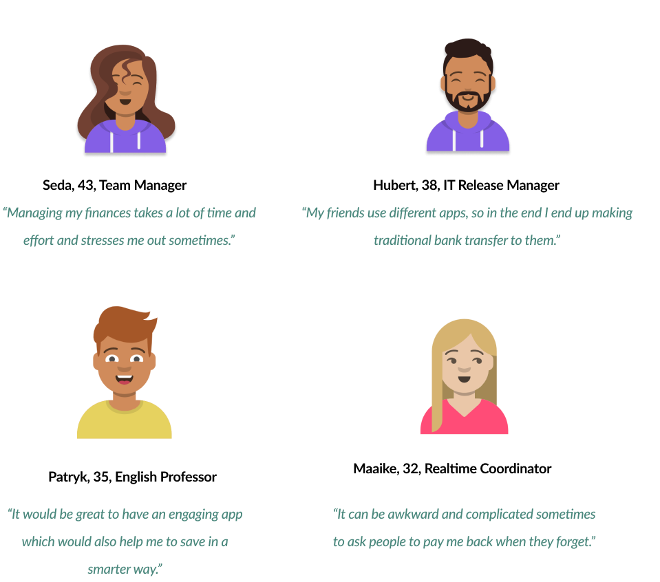
Initial Insights
Excel was still the most commonly used tool for budgeting.
Most participants had to follow-up on late payments as they did not have any reminding system.
Transferring money was problematic for some users as their group of friends often used different apps.
Budgeting features did not offer them insights into their spendings.
Participants did not like having to go manually through their past transactions.
What people are saying...
Affinity Mapping
After user research as a next step I structured and analyzed all the data to uncover further insights into users needs and challenges encountered by them. I sorted the data into clusters to discover common patterns and pain points. It helped me to make a decision which features to include in my design.

Main Insights:
People prefer to manage their finances online as other methods are time consuming and they need to save time.
Freelancers and professionals prefer to pay in a contactless manner because they find handling cash unsafe and inconvenient.
People are missing the personal touch in their finance apps and would benefit from having more customizable and personalized ways to manage their finances.
Unclear saving goals stop people from saving more efficiently.
People cannot find all-in-one solution for payments and budgeting.
There is currently no automated way for users to manage budgeting and request outstanding payments.
People miss an easy and motivating way to stick to budgeting goals to be able to save up more.
Define the Problem
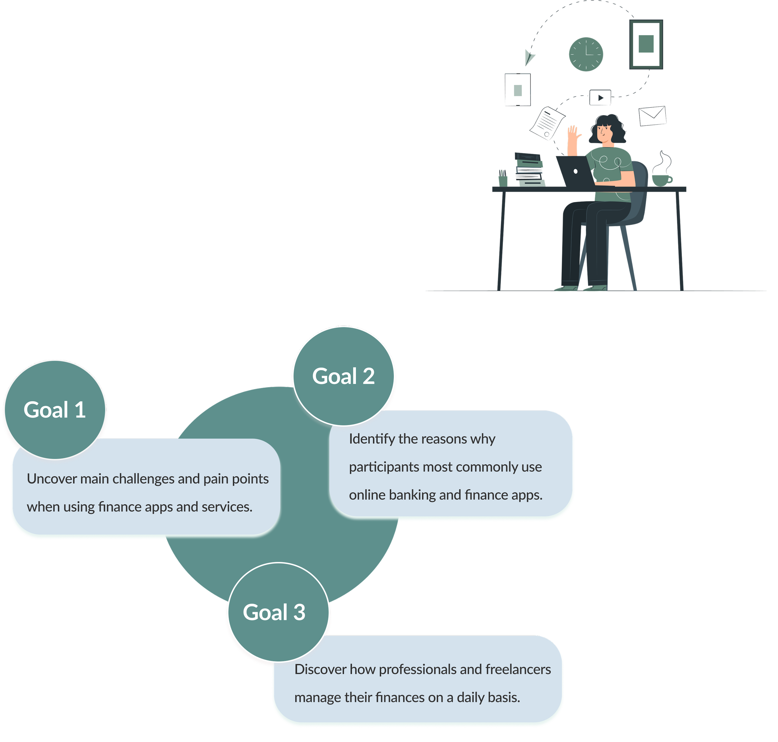
Based on the results and insights gained from my interview sessions, I was able to form the problem statement consisting of the core design problems discovered in my research.
Problem Statement:
Freelancers and Professionals need a secure and easy way to make and request payments on the go and to improve their budgeting, because they need a centralized way for them to manage all of their financial needs. We will know this to be true when we see people using our web app on a daily basis to achieve their financial goals.

User Personas
After analyzing insights gained in my user research. I decided to create 2 unique user personas to guide my next design choices. They formed a base for creating emotional connection between my goals from the problem statement and my actual target demographics.

User Journey Maps
I created user journey maps for each user persona to catch their thoughts, emotions and feelings while completing specific tasks. It helped me to create a better emotional bond between my user personas and allowed me to think about possible solutions to the difficulties they may encounter while using my design.

Insights and opportunities:
Create informative Home page with tutorials and information about the product to help new users looking for best tool for them.
Ensure that the onboarding process is quick and clear.
Provide transparent information about fees.
Create clear confirmation screens showing the status of the request and confirmation of a successful or failed transactions.
User Flows
The architecture started coming up together via in-depth user flows of various tasks. It helped me to explore potential pathways users would take using my web app to accomplish their goals in a most straightforward way. By mapping out my user flows for Marcus and Simone, I was able to break down their step-by-step process to be able to create better user experience for them.
User Flow - Requesting new payment User Flow - Setting a new budgeting goal


Ideate
Card Sorting and Sitemap
To see the most important sections of the app and different possible navigation flows, I created my initial sitemap. To find out if my initial ideas were shared by others, I performed a hybrid model card sorting study. I asked participants to categorize items into pre-defined categories and create their own category labels without having access to the specific context. Card sorting revealed that most of the participants decisions were in line with my ideas. However, some of the cards were grouped slightly differently. I decided to make further changes to my sitemap as the insights gathered from participants were informative to my research.

Low fidelity wireframes
With a sitemap ready, I started sketching my design ideas on paper which resulted in the first versions of the low fidelity wireframes. The screens represented the main features of the app to illustrate main user flows.
Goal: Request money from your client

Mid fidelity wireframes
Further design iterations and testing helped me to create more detailed mid fidelity wireframes in Balsamiq representing further basic functionality and improve placement of elements across different screens.

High fidelity wireframes
To refine my design, I switched to Figma to start creating high fidelity wireframes to improve navigation and to better visualize information architecture.

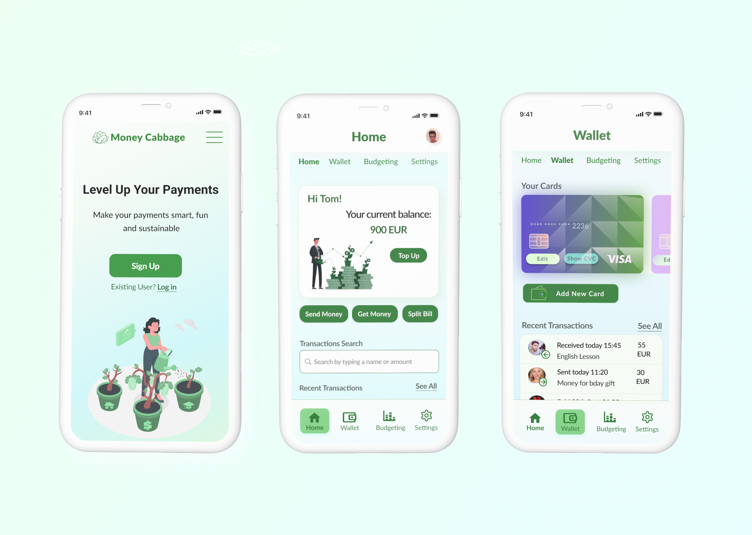
High Fidelity Prototype
After performing initial testing of the wireframes on my peers, I have made some improvements in my wireframes and started turning them into an interactive prototype. Having a clickable prototype was essential for me to see my design in action and to be able to test it further during usability testing.
I added hotspots and linked screens to simulate real life interactions. I created main features: Dashboard, Virtual Wallet, Budgeting and added essential screens to allow my future testers to perform various tasks using my prototype.

Usability Testing
To be able to test my prototype on carefully selected volunteers, I started off by creating a usability test plan outlining the scope, goals, objectives and methodology.

Analyzing the data
Usability tests not only provided valuable insights into opportunities for improvements in my prototype but also reinforced some of my initial design choices.
To help structure the analysis of the results, I created affinity map and translated the findings into rainbow spreadsheet. It has allowed me to capture the frequency and severity of the problems discovered.
Affinity Map

Design Iterations based on usability testing
After collecting and categorizing all observations, positive and negative quotes along with encountered errors, I decided to make strategic decisions regarding which parts demand instant iteration. I used Jakob Nielsens 0-4 severity rating system to determine which changes are critical for the users to accomplish their goals and hence require immediate iteration.
Prototype updates based on user testing
Issue #1:
Dashboard: Some Participants were expecting Home instead of Dashboard or kept calling Dashboard Home. (Severity: Level 3)
Improvements: I changed the name from Dashboard to Home on all the screens.

Issue #2:
Request Money: Participants were not sure if the payment request was sent successfully as the success screen was not clear enough. (Severity: Level 2)
Improvements: I changed the last 2 steps in 'Request Money' flow to ensure users confirm the request first before they are presented with a clearer success screen. I have removed 'Repeat Request' from these screens as 2 participants found this option confusing at this stage.

Preference Tests
Following-up on the design iterations resulting from the usability tests, I decided to perform 3 preference tests as I wanted to get people’s responses to my Home Page, Onboarding and Dashboard to ensure best functionality and usability. During each test, participants were presented with 2 versions of the same screen and were asked to pick a design which they prefer and shortly explain their choice.
Test 1: Home Page
Purpose: Determine whether users preferred 1 CTA button to be able to sign up with an option to log in visible just below it (image 1) or 2 separate buttons for ‘Sign up’ and ‘Log in’ (image 2).

Results: I decided to use option 1 in my updated prototype version. Previously I placed the ‘Log in’ button at the very button of the page but I decided to move it to the center of the screen to test my new idea. I believe this option will be more intuitive and less confusing for more users.
Test 2: Dashboard
Purpose: Explore potential options for improvement in my Dashboard design. I created image 2 to see if users would prefer to see information about features displayed horizontally.

Results: Overall, both designs were perceived by some users as chaotic and overloaded with information. I will therefore think of a better design solution which will use the icon design from Image 2 as users liked it more but rearrange their placement.
Peer Feedback
As a next step, I reached out to fellow UX/UI Design students and my Mentor to ask them for their feedback regarding my prototype.
I analyzed feedback gathered and assessed severity of problems based on Dumas and Redish scale in order to make further improvements.

Feedback - Landing Page:
“The typography of this text is a little too similar to the one below. I suggest you change the font to make a bigger difference between the texts.”
“I would recommend to highlight the intro about Money Cabbage.”
Severity Level 3

Feedback - Home:
“Why welcome back? I am a new user…”
”I feel it's a bit hard to understand what the "Budget" stands for, and what does the circular graphic mean. Is it purely decorative? My first impression is that it's a diagram that shows how much I've spent in different categories.”
Some users were not sure about the hamburger navigation and having to click 2 times to access different features.
Severity Level 2

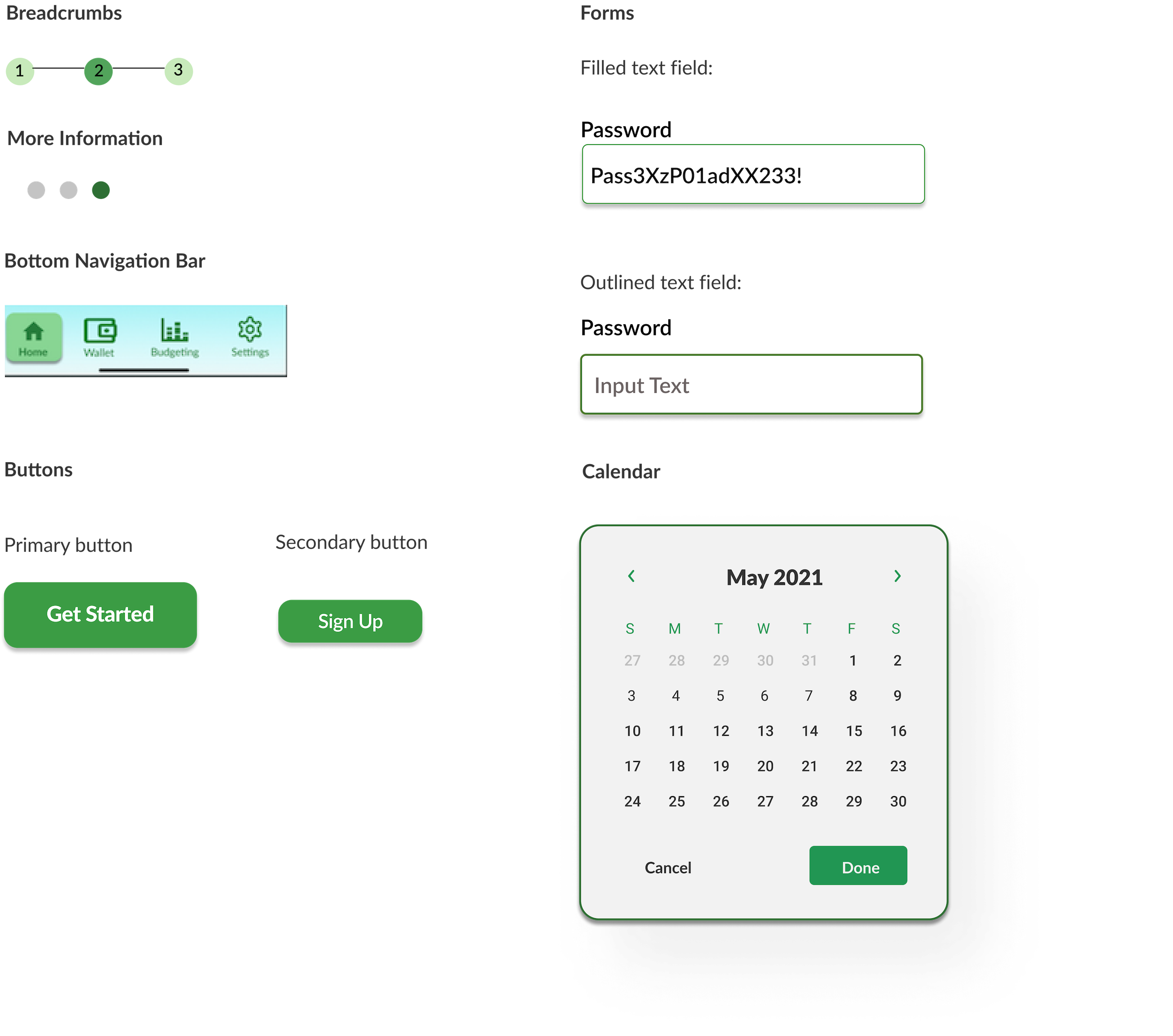
Design System
Design Documentation
As I polished my design further, I created an interactive Styleguide to ensure consistency in the user interface and improve the working process for the developers and other stakeholders. I crafted it carefully and thoughtfully to create an enjoyable and fun aesthetically pleasing experience for users.
Color Palette
Cheerful, harmonious color theme.
Money Cabbage uses colors strategically to communicate how various features work in the interface. Our color system helps the user to navigate around the app instinctively making the product more usable. Color palette also helps to distinguish our brand and creates consistency across various devices.

Primary color variants
This color should be displayed most frequently to be used for displaying company logo, name, most important information and branding content.

Secondary color
This color should be used to highlight select parts of UI and to make the interaction fresh and interesting.

Typography

Money Cabbage utilizes a purposeful set of typographic styles to help create clear hierarchies, organize information and guide users while navigating around the product. Consistent typography choice helps us to present our design and content as clearly as possible and makes the product more intuitive to use.
Iconography
Product icons are a visual expression of Money Cabbage. They help users quickly accomplish their goals and guide them to make correct decisions.

Imagery
Money Cabbage uses a collection of images in a repeated pattern to improve comprehension of the product and to ease navigation. Image content relates to financial matters, payments and budgeting but brings the communal aspect.

Avatars

To be used for a profile photo, senders and receivers photos and contact list.
Common UI Elements
Final Visual Design
Following usability testing and preference tests I have made several changes to the layout and content hierarchy which resulted in the final prototype version. The design language in Money Cabbage is consistent to create an intuitive and smoothless experience for our users.

Final Prototype
After analyzing feedback received and going through the iterations of my prototype, it was time to refine my design by consciously applying visual design principles, Gestalt Laws and following closely accessibility guidelines.
Discoveries and Conclusions
The initial app concept and hypothesis were modified based on user feedback which only proves how important extensive user research and iterations truly are in the design process. What I have learnt during this case study is the true value of research, testing and feedback.
Here are some of the main learnings:
Iteration is the key - I have learnt how important it is to make constant changes to the design, even at very early design stages.
Value of user research - It is a core for the UX design process as without it, it is not possible to create truly user-centric experiences and address real problems faced by people.
Assumptions are to be discarded - I learnt first-hand how assumptions can truly cloud our vision and stop us from uncovering and resolving real people’s problems. As my user testing proved, assumptions are very often untrue. Only by interacting with real people and by truly empathizing with their struggles on their journey can we create relevant and useful experiences for them.
Next Steps
Although this product was created as a concept only, if I were able to release it, I would like to focus further on the following concepts:
Improvement and expansion of the budgeting feature
Scan & Pay feature
Deepen the level of accessibility by including voice control
Implementation of other currencies to make it truly global

Thank you for reading!
Feel free to share your thoughts about the design and my presentation.
Let’s get connected!
Get in touch with me via email or connect on LinkedIn for job opportunities, collaborative projects or just to say hi and have a chat about design!
Check my other projects:
Head back home:
Copyright © 2026 Karolina Kopacz. All rights reserved.